Enhance Squarespace Forms with a Custom Datepicker Field
Beyondspace’s Datepicker Form Field is a Squarespace plugin that replaces the standard date input with a calendar-view control, allowing users to select dates with ease. It features month and year view options for quick navigation, ensuring a smooth user experience. Users can set up disabled dates and cutoff preorders, enhancing the functionality of their forms.
* Plugin works on Squarespace product forms – it does not apply to the checkout form.
Getting started
Requirements
To activate Datepicker plugin you must have:
Squarespace Business plan or higher
Squarespace 7.1 or 7.0 templates
Installation & Update
After purchasing Squarespace datepicker, you will receive an Installer script in the post-purchase confirmation email, following the steps will help you activate the plugin, there is no need of coding knowledge to complete, mostly point and clicks.
Squarespace datepicker installation
Licensing
Each copy of Squarespace Datepicker instance will be licensed to the single site, and the price is one-off payment.
Discounts
Check Spread it with the world and earn discount!
Features
Squarespace Datepicker is packed with extended and advanced functionalities which allow you to easily customize the datepicker.
Squarespace Datepicker works out of the box with the native Squarespace forms elements, including:
Form Blocks
Form Blocks in lightbox mode
Product Forms
Product Forms in /cart page
Product Forms in Quick View modal
Product Forms in Product Blocks
Summary Blocks with Store collections
The plugin is also compatible with the newest localised Form blocks of Squarespace.
Datepicker on Cart page example
Due to Squarespace security policy, Squarespace Datepicker can not work on these kind of forms:
Product Checkout form
Donation blocks
This restriction is in place because Squarespace does not permit any custom code to be added to these sensitive areas of the site, ensuring the integrity and security of the checkout process and donation transactions. Consequently, third-party plugins and extensions, including the datepicker, are unable to modify or enhance these specific forms.
Squarespace Datepicker is compatible with several Squarespace plugins:
Squarerefresh Shopping Cart Plugins
Setup a Datepicker form field
Based on the placement of forms, you need to insert to insert a Text field into Product Form or Form block.
Check this post on how to Insert Delivery datepicker for your Products
Note: the Product form modal on /cart page is inherit from Product form.
The Mapping: Converting Text Form Fields to Datepickers
To turn a text form field on supported form elements into a datepicker, follow these steps:
Define the Name of the Datepicker rule Settings:
Use a consistent naming convention for the datepicker rule settings. For example, you might name the settings based on the specific form or field they apply to, such as
deliveryDateSettingsorpickupDateSettings.
Set the Placeholder value:
In the placeholder value of the text field, enter the exact value you chose in previous step in the form field's placeholder, such as
deliveryDateSettingsorpickupDateSettings.While Name or Title represent the field's purpose and can be seen by your visitors, such as "Select your delivery date" or "Choose a pickup date". The Placeholder attribute specifies a short hint that describes the expected value of an input field. We use the Placeholder for the mapping because it stays hidden from visitors.
Configuration example:
Datepicker Rule name:
deliveryDateSettingsPlaceholder value:
deliveryDateSettings
Images below explains the placeholder value of forms and how to map the text field to a datepicker rule:
Note to user: after installation and activation, the plugin can be working out of the box, by setting the placeholder value of your Text field to Date Picker with all the default settings.
Live Playground
The previous section explains the field mapping mechanism, and we provide you with a live playground that helps you update the rules by yourself.
Squarespace Datepicker allows you to update the settings of the form field using a visual playground where you can just point and click to update the settings. Scroll down to bottom of the page Squarespace datepicker to access the Configurator.
Get your site current config by puting the website URL into the Widget Configurator, after finishing the edit, copy the generated snippet and replace the current Beyondspace Squarespace datepicker in your Footer code injection.
Squarespace datepicker configurator
You can learn step-by-step tutorial on how to update Squarespace datepicker settings using playground in the video below
Multiple Datepicker instances
Squarespace datepicker allows you to use multiple datepickers on a single site, each with distinct settings. This means you can have two or more datepickers on your site, each with a different set of requirements. For example, you could have one datepicker with a 7-day lead time for product A and another with a 14-day lead time for product B, allowing you to manage availability and customer expectations independently for each product.
Support settings include:
Date format
Timezone
Cutoff time
Lead time
Disabled weekdays
Disabled & Enabled dates
Inline display mode
Date format support
Date formatting allows you to display dates as strings in a standard format based on cultural specifics or user preferences.
You can save the date in any format you choose, providing great flexibility. For example, formats like day/month/year for AUS-based or month/day/year for US-based.
Different countries use specific date formats. The date format defines the structure of the displayed date in the text box. You can customize this by using the Date Format input.
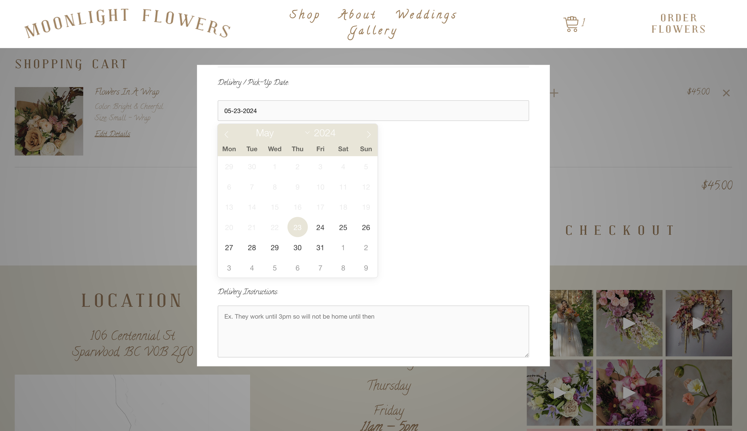
Date format month/date/year on moonlightflowers
Timezone support
The Squarespace datepicker uses IANA timezone format for its timezone settings.
By setting the appropriate timezone, you can prevent discrepancies that arise when your site visitors are in different timezones. This setting impacts:
Identifying today's date, past dates, and future dates in the datepicker.
Determining the current time, which is crucial for setting same-day delivery rules based on the Cutoff time.
Examples:
November 9th in Argentina might already be November 10th in Spain. To correctly disable a date in the datepicker, set the timezone explicitly.
If a flower shop has a same-day delivery cutoff at 11:00 AM, ensure the timezone is set to the flower shop's location for accurate timing.
Timezone Asia/Singapore on lorvefloral
Cutoff time
Cutoff time is essential for implementing same-day delivery in your store. If the cutoff time has passed, the next available date will automatically move to the following day.
Examples:
If your cutoff time is 11:00 AM and today is September 12th:
At 12:00 PM, the next available date will be September 13th.
At 10:00 AM, today's date will still be available for selection.
Note that Lead days (preorder days) are also considered if you have set a value for them.
Ensure that the cutoff time is set according to your chosen timezone to maintain accuracy.
Cutoff time is set at 11:00 for lebouquetfloral
Preorder Days (or Lead Time)
Lead time refers to the duration between the initiation and completion of a process. For example, if your fulfillment process takes 4 days from order placement to delivery, your lead time is 4 days. This means you wouldn't want to offer a delivery date sooner than you can actually fulfill it.
Squarespace Datepicker allows you to add a lead time, blocking dates within this period from being chosen. For instance, if a customer places an order on the May 22th and your lead time is set to 10 days, they won't be able to select any date before the Jun 01st.
Note: The soonest available dates will also be calculated based on any disabled dates you have set. This ensures that only valid dates within your lead time and outside of any disabled date ranges are selectable.
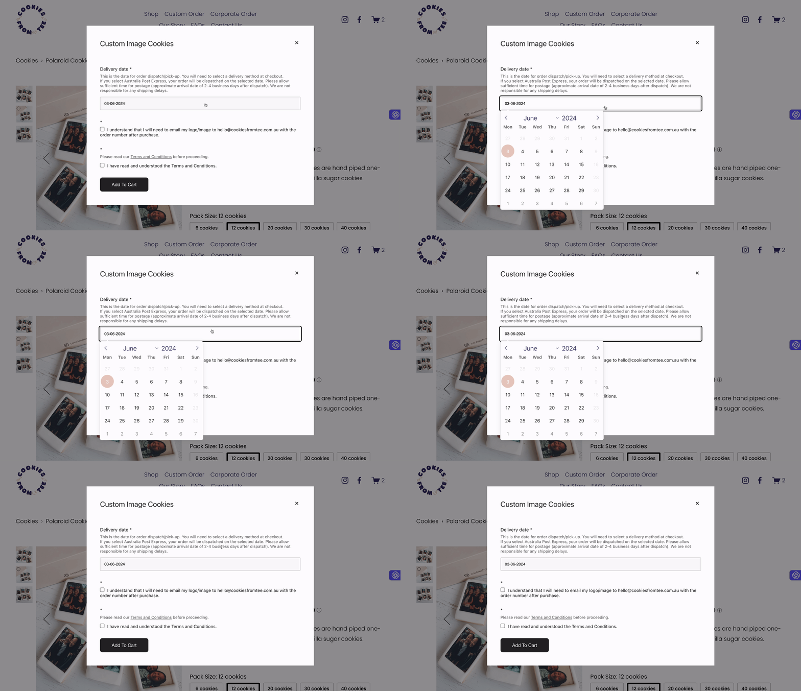
Preorder days value is set as 10 on cookiesfromtee
Disabled Days of the Week
With Squarespace Datepicker, you can easily disable specific days of the week according to your business needs.
When adding disabled days and dates to the lead time, it's assumed that these dates are not considered "active business days" and will be excluded from the lead time calculation. This means that disabled days won't be counted in the lead time calculation.
For example:
If you have a lead time of 10 days.
Saturday and Sunday are disabled.
A customer is placing an order on Wednesday, May 22, 2024.
In this scenario, the customer won't be able to choose any date before the next Monday, June 3, 2024. If Saturday and Sunday weren't disabled, the customer could choose the delivery date as early as Saturday, June 1, 2024.
Simply check which days of the week that you would like to disable.
Disabled dates
In addition to disabling weekdays, you can also disable specific dates. The plugin allows you to disable individual dates or date ranges as needed.
Note: When disabling specific dates, keep in mind that these dates will no longer be available for selection by users. Ensure that you choose the correct dates to disable to align with your business requirements or any scheduling constraints.
gisborneflowershoppe disabled all Australian public holiday
Enabled Dates
Utilize this feature to enable specific dates within the disabled list, supporting both single dates and date ranges. Specify the start date and, if applicable, the end date to enable individual dates or a range.
Inline mode
In inline mode, the datepicker is displayed alongside other form controls. When disabled, the datepicker remains hidden by default and appears as a floating element upon clicking the date input.
Squarespace datepicker float when inline mode is off
Known Limitations
Custom Product Forms vs. Custom Checkout Forms:
Custom product forms are great for gathering information related to individual items. However, if you need to collect information for the entire order, such as a gift message or special delivery instructions, you'll need to create a custom checkout form.
Unfortunately, the datepicker plugin cannot be added to the Checkout page. This means it cannot be used on Custom Checkout Forms because Squarespace does not allow any code to be added to the Checkout page due to security concerns.
Multiple Products, Multiple Dates Issue:
When the datepicker is added to each product form, customers can select different delivery dates for each product if they are checking out multiple items. Currently, there is no built-in workaround for disabling multiple dates within the same order. This means that each product in an order can have a different delivery date, which might not align with your operational preferences.


